
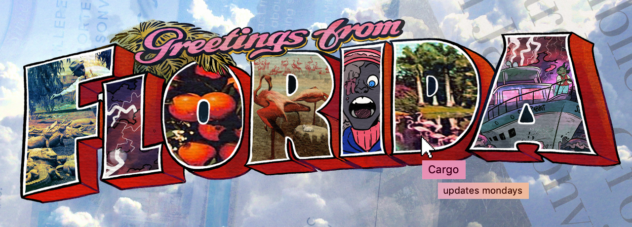
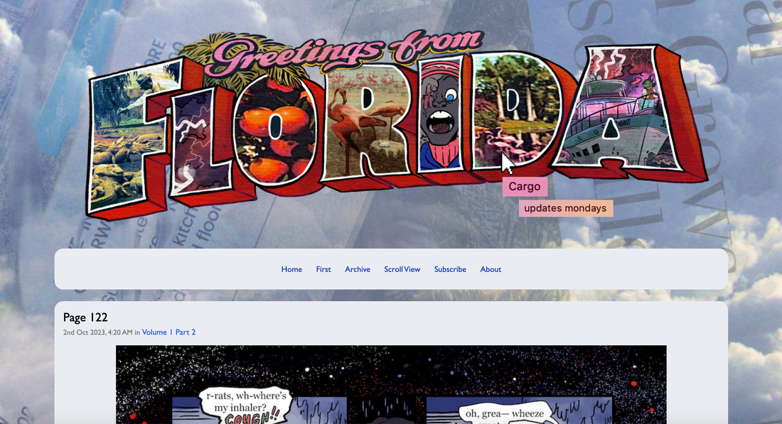
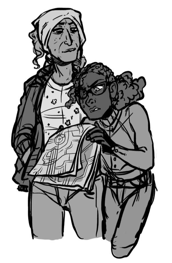
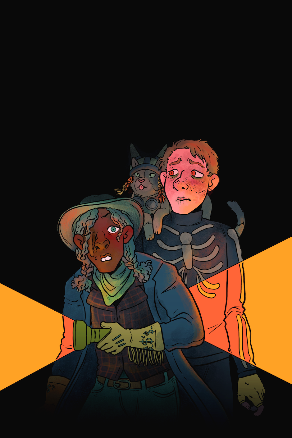
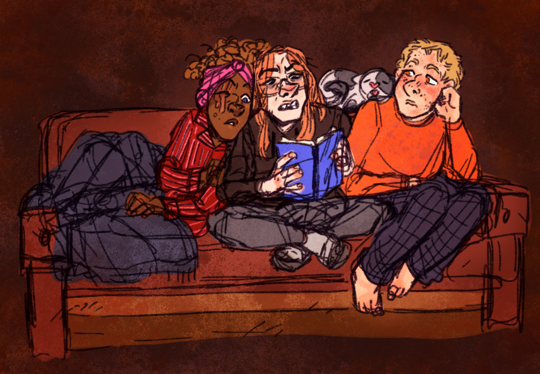
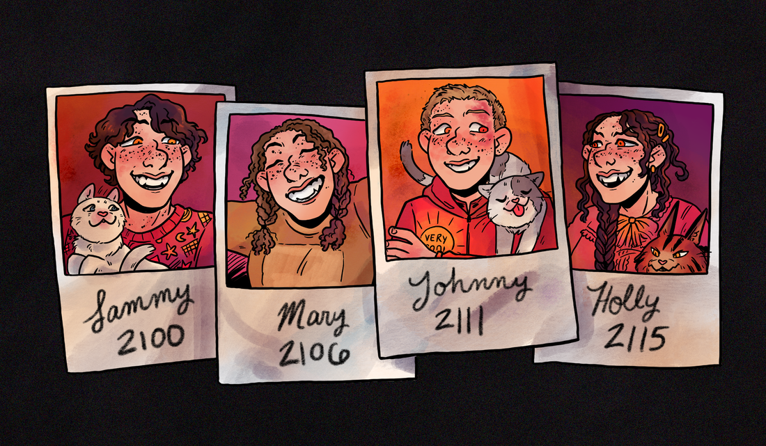
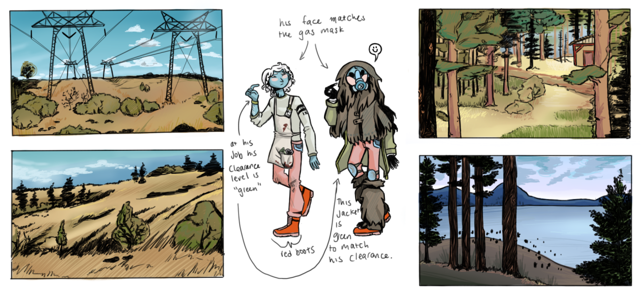
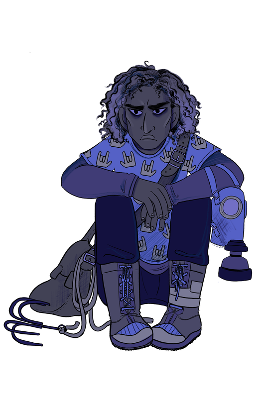
Pirate comic, aka Cargo is my personal project. The year is 2111, everything is illegal, and the country formerly known as the United States is a zombie-infested winter wasteland. Certified Floridawoman SJ Khan and her long-time friend Matt Carter have decided this is the perfect time to start a smuggling company.
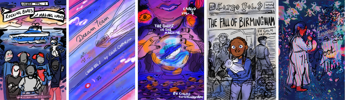
Visual design: Covers
With the cover design for Cargo as a series my main goal is "artistic harmony but without echo"... I want each cover to feel like they're aesthetically coherent but also like they build a distinct atmosphere for the collection of chapters that are included within that specific volume.
I love working within a really rigid set of rules and in my previous webcomic I used really rigid compositional standards to design my issue covers so they would "match". I'm really excited to do the Cargo volume covers with more of a goal towards pushing difference and specificity while maintaining harmony, because I think it's gonna work super well for the story as a whole BUT ALSO I also think it's going to be good for me as an artist, too.
I love working within a really rigid set of rules and in my previous webcomic I used really rigid compositional standards to design my issue covers so they would "match". I'm really excited to do the Cargo volume covers with more of a goal towards pushing difference and specificity while maintaining harmony, because I think it's gonna work super well for the story as a whole BUT ALSO I also think it's going to be good for me as an artist, too.
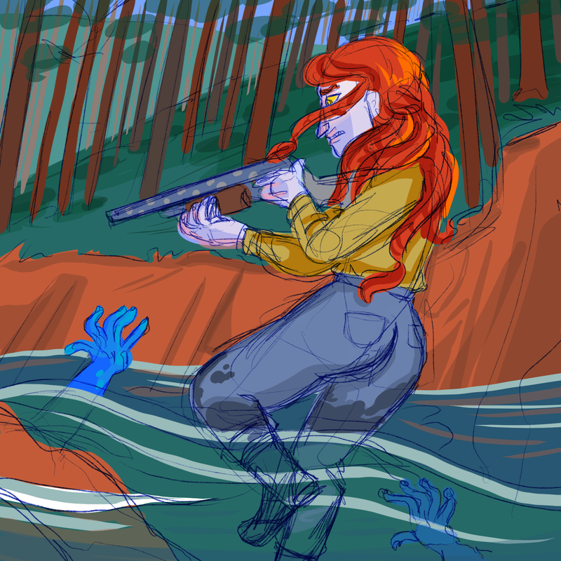
 Sketch concepts for random volume covers. I really love covers HA
So, guidelines:
-the opposite of standardized we're going for DIVERSITY!!!!!!
-every volume needs to have "specificity" to it... think about what makes the specific volume unique. what thematic or stylistic through lines can I really shine a light on??
-don't forget to make text unique too
-never have characters in the same placement/size on the cover
-through line: the red/white/blue color scheme and generally a similar level of brightness
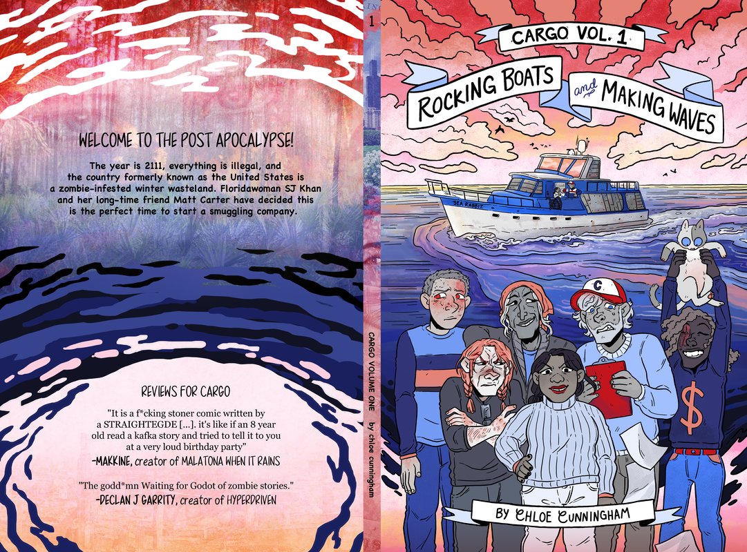
Cover for Volume 1
|
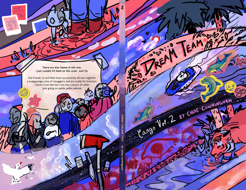
Sketch design for Volume 2
|
Visual design: Website
One thing I love about self-hosted webcomics is their ability to use the website to immerse the reader into the comic. It's like stepping into a stranger's house and noticing their clutter or lack thereof, the type of art they have on the walls, the wear of their furniture... I hope that the design of my website aids in an immersive reading of my comic, the same way I hope my book design does that.
|
I am not a website designer BUT I do put a lot of thought and effort into making the assets of my ComicFury hosted site enhance the reading experience of my comic while remaining clear to use. It's hard! I don't know how to do HTML! But I think that doing what I can to make the site feel "correct" to read this comic on is important.
|
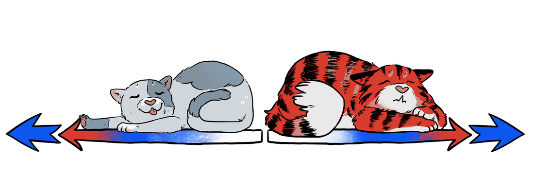
The page turn buttons for my site.
|
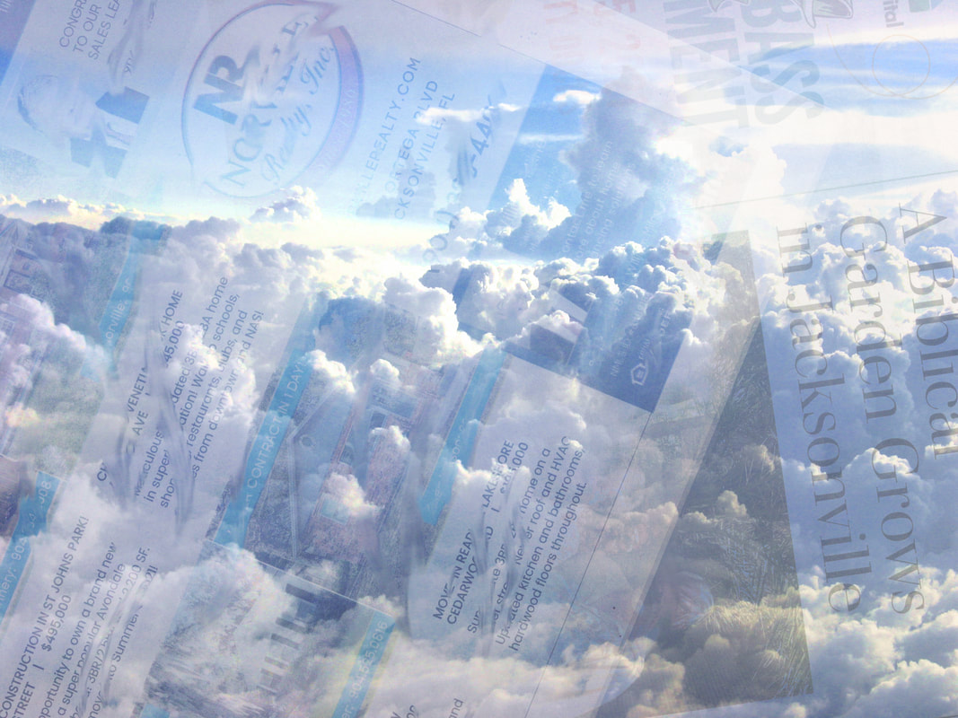
The website background.
|
My comic is limited palette and primarily uses desaturated blues, greys, and some spots of red/pink. I also use a lot of various texture overlays and some collage elemeents throughout the comic, most of which are assets I've either made myself or taken from fair use files on Wikimedia Commons. I tried to lean into those elements in my website design! It was actually surprisingly hard to find a set of colors/overlays that both had the right "character" for what I was going for but also don't clash with the more vibrant pages in the comic.
|
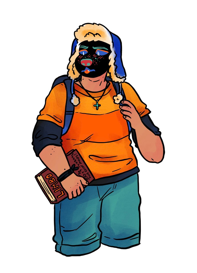
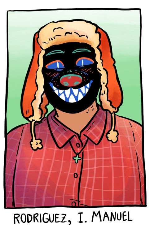
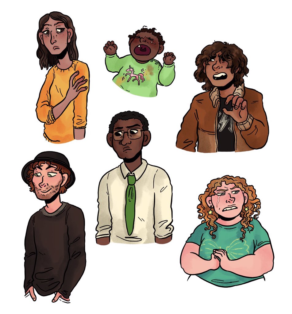
character References
To be honest I've had these characters for a really long time and so in many ways they predate my current character design sensibilities.
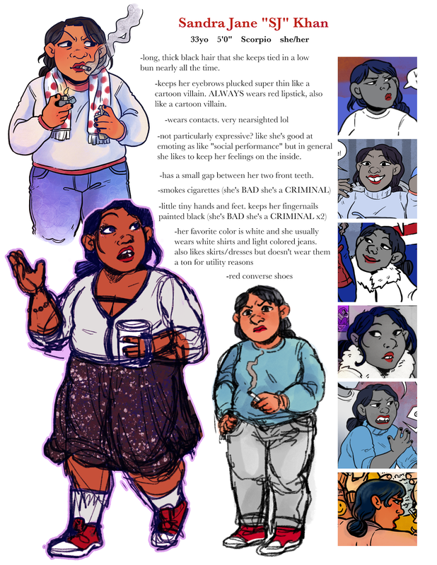
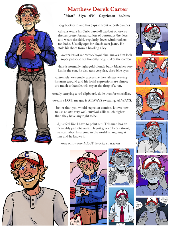
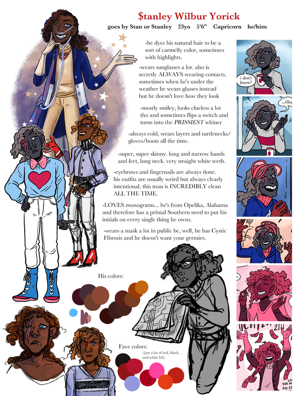
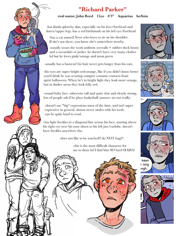
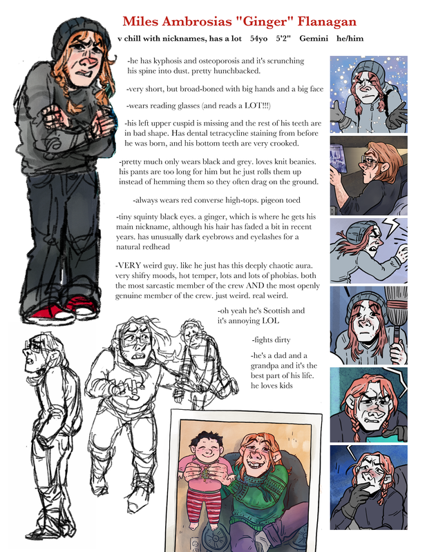
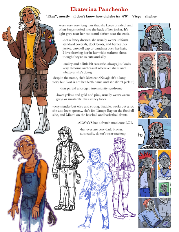
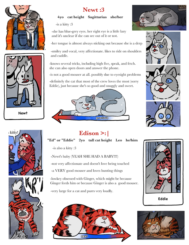
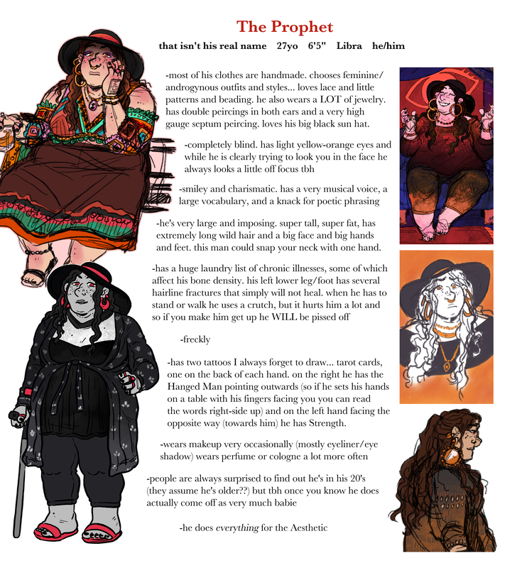
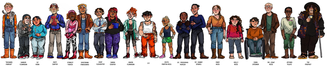
When I conceptualize a cast I make them based off simple thematic concepts that interest me, and then develop the whole cast together based on which traits I think will make for interesting relationships with either each other or with the greater plot or world of the story. The main characters of this particular cast were first based, very loosely, on the idea of "the army of hell".
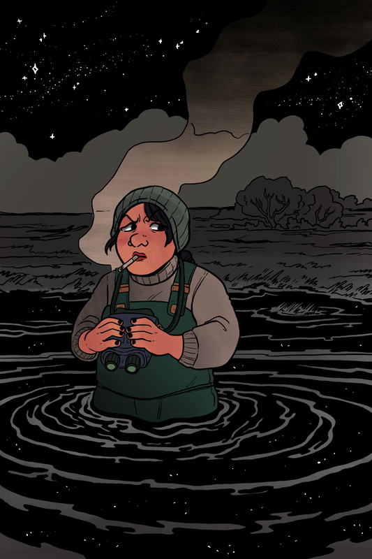
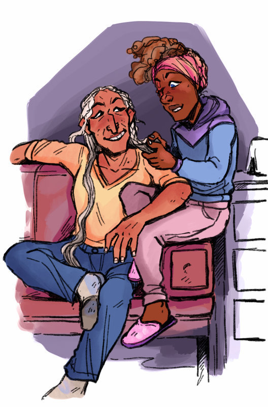
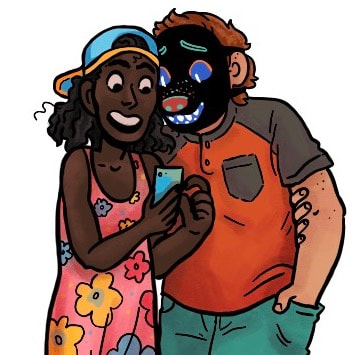
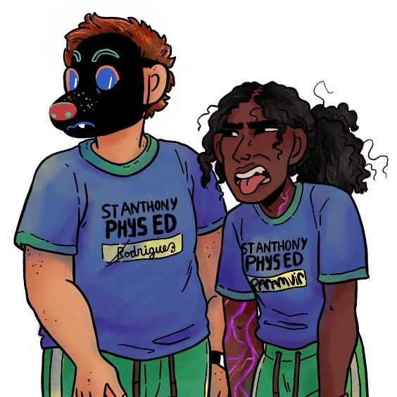
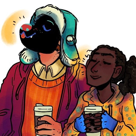
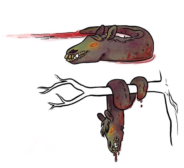
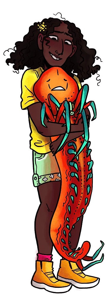
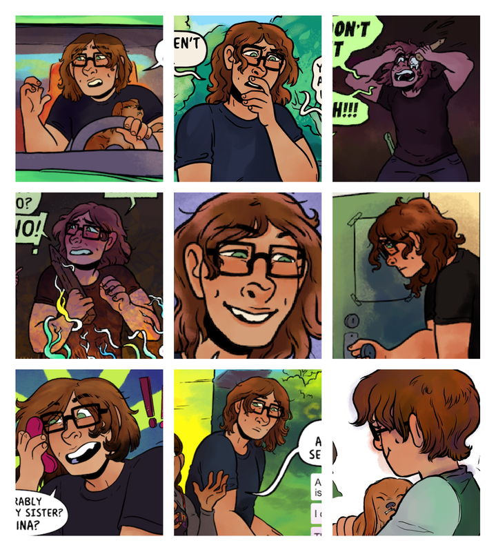
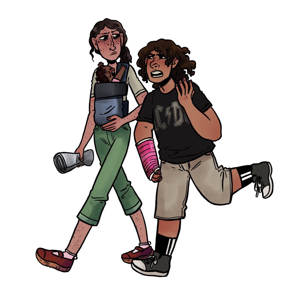
Assorted Art
|
|
|
Read online!
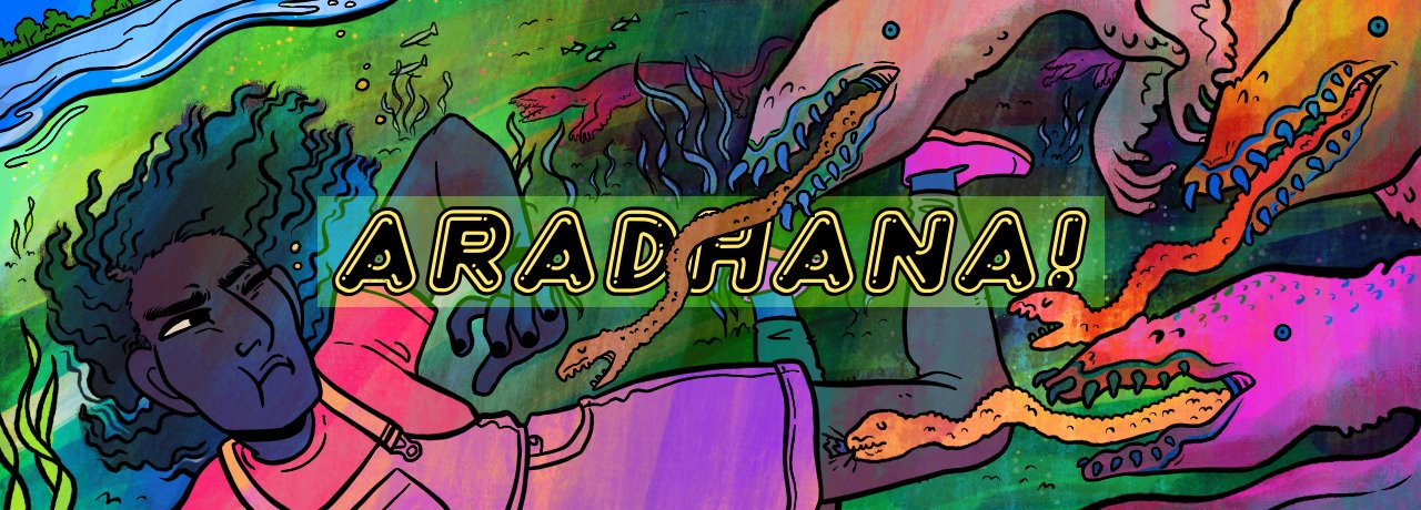
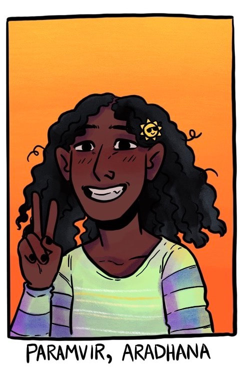
Aradhana! (working title) is my other big project, a middle-grade/YA graphic novel. When livewire city girl Aradhana is killed in a magical accident, she’s given a second chance at life in an alternate dimension riddled with weird creatures, dangerous magic, and bffs from Hell (literally). It’s a fantastical horror-comedy about friendship and the logistics of solving your own murder.
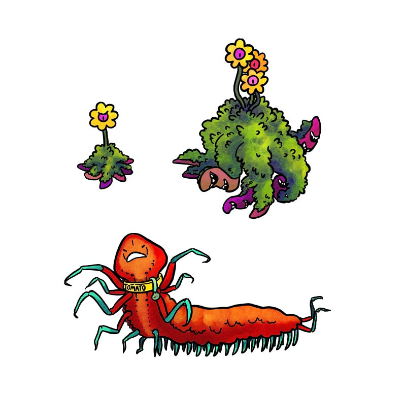
concept and character art
|
|
|
|
|
|
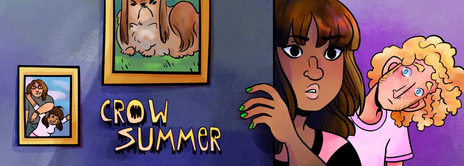
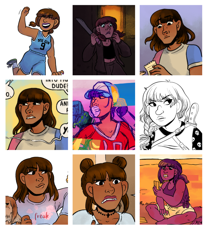
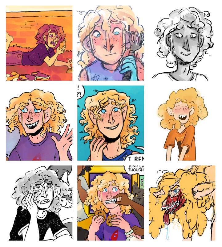
Crow Summer is my major webcomic project, and has been continuously running since July 2016. It's a rural fantasy comic about a student vampire hunter who gets stuck babysitting over her summer vacation. It's a cheerful coming-of-age story about wrangling werewolves, trying (and failing) to disbelieve the existence of ghosts, and overcoming big mistakes.
concept and character art
|
|
|
Read online!
An irascible teenager with the superhuman power to write strangers’ biographies discovers a villain whose machinations will destroy two interconnected realities… and nine seemingly random Bostonians have the power—but not the necessary knowledge— to stop her.
concept and character art
|
|
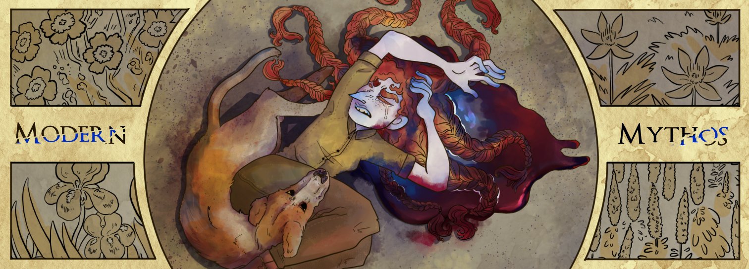
Last but not least, Modern Mythos is a comic currently in pre-production… I'm hoping I'll be able to make it in a few years when I'm almost finished with Crow Summer!! It's a zombie-apocalypse superhero story about a girl who goes on a quest to kill the sun god in order to save her brothers from being executed in a gang power-struggle. Hijinks ensue.
concept and character art
|
|